Get new exclusive access to healthcare business reports & breaking news
In April 2018, Blue Cross Blue Shield of Illinois officially announced the launch of the Making the Health Care System Work magazine, a new project from Blue Cross and Blue Shield Plans in Illinois, Montana, New Mexico, Oklahoma and Texas.
A short-branded video introducing the magazine can be accessed here.
From the introductory video, we get a glimpse into the overall mission: “Too often, health insurers are portrayed as part of the problem. […] Welcome to Making the Health Care System Work, an online magazine dedicated to sharing stories about innovating and forging collaborative solutions that improve the healthcare experience.”
As a media company in the healthcare space, we at HealthcareWeekly welcome any payer or provider’s attempt to help consumers get a better understanding of the complex healthcare landscape in America today. With Making the Health Care System Work, BCBSIL is joining the ranks of MayoClinic and Kaiser Permanente by launching a thought leadership platform dedicated to educating consumers and companies in the US.
Making the Health Care System Work, provides quite informative content that any executive in the healthcare space should consider reading.
Unfortunately, in order to enjoy the content, one must look beyond the confusing design, look and feel of the new magazine and the many violations of user experience principles every media website should follow.
In this article we will cover 5 points about Blue Cross Blue Shield’s violation of best design principles. Hopefully someone at BCBS will see these points and act on them.
Premise: the Making the Health Care System Work magazine is the epitome of a “great idea, botched execution” from a visual point of view.
Evidence: We will highlight bizarre interactions on the current homepage, poor design choices, readability issues, strange header interactions and lack of information structure. In short, pretty much every significant user experience principle that the BCBSIL team could have gotten wrong, they did get wrong.
When you first land on the Making the Health Care System Work website, it doesn’t really look or feel like a magazine. The provider chose an uninspired design that is closer to Pinterest than the New York Times (or any other legitimate news outlet).
Let’s take a look at it:
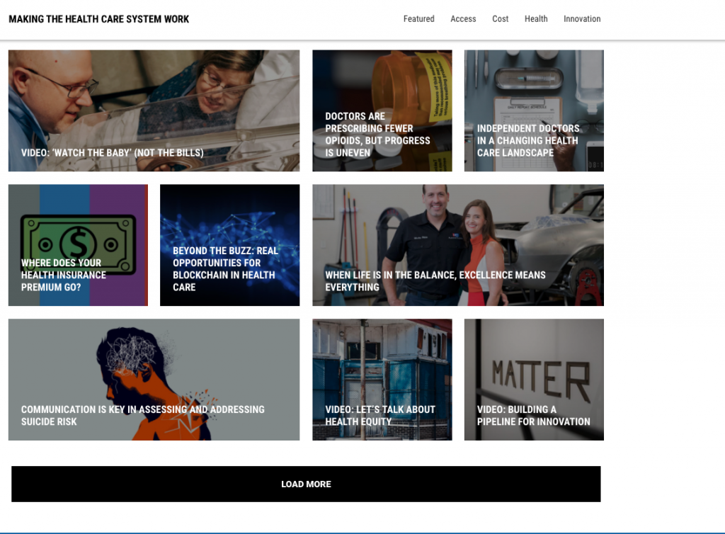
Just like Pinterest, the homepage design for Making the Health Care System Work is a series of tiles, each taken by a specific article, but worse. Why is it worse? It’s worse because the website mixes together a variety of content types on the homepage with no clear content organizational logic.
Articles, videos, and newsletter sign-up callout are each treated equally, from a visual point of view. Which, of course, Should not be done.. As a user, I need to easily understand how the website is structured, and how to properly navigate it. This uninspired design does not do that.
Secondly, the team made another unfortunate decision by not listing the author or the date an article is published. That means returning visitors would have a hard time understanding when the website adds new content without carefully reading each tile.
Third, from a pure usability perspective, it has long been established that listing all titles in CAPITAL letters is a really bad UX idea. Text in all caps is really difficult to read, aesthetically displeasing and tiring to the eye. By all UX standards, capital letters should only be used in logos, headings or abbreviations.
The American Disability Act of 1990 is a comprehensive civil rights law that protects individuals with disabilities from discrimination. Since its inception, ADA guidelines have been applied almost exclusively to rules and regulations regarding public access to buildings, public areas, public transit, etc.
In 2010, the ADA issued a series of rules and regulations about website accessibility. In so doing, it opened the gates for lawsuits from both individuals and companies representing individuals who cannot access information on a website due to failure to create user experiences that live up to minimum standards of accessibility.
Going back to Making the Health Care System Work, it is more than a little bit bizarre to see callouts to users to sign up for newsletters:

What’s the problem? By using a light white font, on a solid blue background, and a tile that is rather small, the design team behind the website didn’t take into account basic readability principles behind the ADAP. In short, this tile is not easily readable and it should be changed right away.
The navigation of a website is the soul of a digital property. If you get this wrong, nothing else matters. Making the Health Care System Work has the strangest global navigation we’ve ever seen:
On load:

On hover:

Having the rest of the header disappear when the mouse hovers over a header word is at best disorienting. As many user experience experts would quickly note, the header is one of the most important elements on any website. The basic principle behind good header design is that the header is expected to remain static and easily accessible while navigating the website.
So what’s wrong with the peek-a-boo Making the Health Care System Work header? It is disorienting. When web users read, they tend to make the cursor follow their reading pattern on a page. When the typical user reading method makes part of the header disappear, it disrupts the reading process by causing the element that should be the most constant to become intermittent, resulting in confusion.
The current site exhibits another peculiar visual cue: the strange animation for loading more articles on the homepage. Clicking on the load more button a few times can cause users to feel queasy because the human brain is not trained to interact with fast moving design elements. On Making the Health Care System Work, new articles are loaded quickly and at an angle, versus the standard practice of smoothly loading more articles below the “Load More” button.
At first sight, an impatient reader would get easily frustrated with the lack of obvious content organization on the Making the Health Care System Work website.
For easiest comparison, take a look at the New York Times. This cite makes it patently obvious how any reader can filter content – by clicking on the main navigation button at the top of the page, by clicking on the tags for each story, or by clicking on an author’s name.
Unfortunately the Making the Health Care System Work website doesn’t easily do any of that. How is a reader expected to see ‘More of the Same’ content? They need to scroll all the way to the bottom of a specific article page where they’re presented with the following options:

In case it is not clear, (and it isn’t!), the labels above (black text, white background) are “tags” and the ones below (white text, black background) are categories. A user can click on either content type to access more similar content.
Final notes:
Although we are critical of the overall look and feel of the Making the Health Care System Work digital magazine, we want to make one thing absolutely clear. Blue Cross Blue Shield hired really smart writers. When you go past the unfortunate failure of the current website’s design, as a reader, you realize that the content is actually quite good. The articles are informative, timely, relevant and very well written.
We have high hopes for the future of the magazine and we salute its passion and dedication to covering topics such as: “Closing the Gap in Transgender Care”, “Beyond the Buzz: Real Opportunities for Blockchain in Healthcare” or “Where does your health insurance premium go?”. These are just a few examples of excellent thought leadership articles. Even though we might expect the magazine to have more relevant content published more often, when it comes to the value of what is provided by Blue Cross Blue Shield of Illinois journalistic work, they’re on point.
That said, they should seriously consider a different visual display and user experience for their digital magazine. The content is too good to deserve such a lousy user design and interaction design.
Interested in more news about Blue Cross Blue Shield? Check out Blue Cross Blue Shield Gives Steep Discounts for Fitbit Products to its 60 Million Members.